Poster A1 | Universal Alphabet | Herbert Bayer
- Delivery time within the country 2-5 working days
- 30-day return policy
- With every purchase, you support the Bauhaus Archive Museum of Design
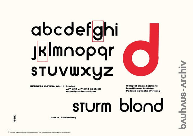
"Attempt at a New Typeface" is the title of Herbert Bayer's 1926 text in the Bauhaus issue of the magazine Offset. The article is illustrated on page 399 with his design for a new "alphabet."
"Just as modern machines, architecture, and cinema express our modern era, so must typography," demands Bayer. Strict lowercase, simplicity, unity in construction, composition in the primary forms of square and circle—these are his requirements. These guidelines shaped many Bauhaus designs around 1926.
On the published sheet, two characters, the g and the k, are described as still unfinished. Bayer thus makes the design process visible.
Herbert Bayer's design is an idealization of simple construction and universal application. However, legibility was neglected; the typeface is more suitable for logos and individual words rather than longer texts.
The universal typeface was used by Herbert Bayer in the 1960s for the logo he designed for the Bauhaus Archive Berlin, as was also adopted by the Bauhaus Shop. In this version, the 'a' and 'r' are further simplified, while the characters 'h', 'u', and 's' are taken from the then-popular Helvetica typeface. For a more harmonious shape and better readability of the lettering, the inner angles of 'a' and 'v' are indented.